Summary for Week Ending May 27th: "The economic data was soft again last week. The Richmond Fed manufacturing survey showed contraction in May, and the Kansas City Fed manufacturing survey showed growth had 'stalled'. The second estimate of Q1 GDP was disappointing (unrevised at 1.8% annualized real growth rate, but the underlying details were weaker than in the advance estimate). And weekly initial unemployment claims increased again. Also the personal income and outlays report for April indicated a slowdown in consumer spending.
There might have been a little bit of good news in a surprising sector: housing. New home sales were up a little (still very low), and although mortgage delinquencies increased slightly, the increase was probably seasonal, with both Fannie and Freddie reporting another decline in seriously delinquent loans. Also lender Real Estate Owned (REO) is now declining. Baby steps ...
Also gasoline prices are now down about 16 cents per gallon nationally from the recent peak - and that probably showed up in a small increase in May consumer sentiment.
Below is a summary of economic data last week mostly in graphs:
• New Home Sales in April at 323 Thousand SAAR, Ties Record low for April
 Click on graphs for larger image in graph gallery.
The first graph shows New Home Sales vs. recessions since 1963. The dashed line is the current sales rate.
The Census Bureau reports New Home Sales in April were at a seasonally adjusted annual rate (SAAR) of 323 thousand. This was up from a revised 301 thousand in March (revised from 300 thousand).
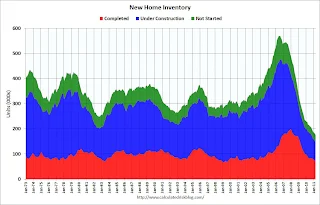 Starting in 1973 the Census Bureau broke inventory down into three categories: Not Started, Under Construction, and Completed. This graph shows the three categories of inventory starting in 1973.
The inventory of completed homes for sale fell to 67,000 units in April. The combined total of completed and under construction is at the lowest level since this series started.
The following graph shows existing home sales (left axis) and new home sales (right axis) through April.
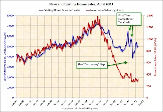 The gap is due mostly to the flood of distressed sales. This has kept existing home sales elevated, and depressed new home sales since builders can't compete with the low prices of all the foreclosed properties.
I expect this gap to close over the next few years once the number of distressed sales starts to decline.
Although above the consensus forecast of 300 thousand, this ties the record low for April - and new home sales have averaged only 298 thousand SAAR over the last 12 months ... moving sideways at a very low level.
• Three Graphs of REO Inventory
Here are three graphs of lender Real Estate Owned (REO) inventory. The first is for Fannie, Freddie and the FHA. Then we add Private Label Securities, and finally FDIC insured banks and thrifts.
 The combined REO inventory for Fannie, Freddie and the FHA decreased to 287,380 at the end of Q1, from a record 295,307 units at the end of Q4. The REO inventory increased 37% compared to Q1 2010 (year-over-year comparison).
The REO inventory for the 'Fs' increased sharply in 2010, but may have peaked in Q4 2010. The Fs acquired 101,997 REO units in Q1, but sold 110,023. Both are records, and the numbers will probably increase all year.
The second graph includes the data for the Fs and adds Private Label Securities (PLS).
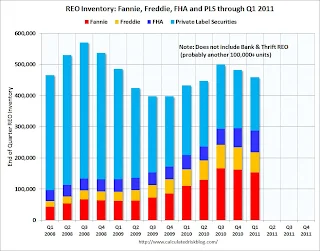 The PLS blew up first because it contained the worst of the worst loans; poorly underwritten subprime and Alt-A.
Also the PLS wasn't set up to effectively manage REO and they just dumped houses on the market. Usually house prices are sticky downwards - prices decline, but slowly. However this dump of REOs led to what Tom Lawler called 'destickification' with house prices falling rapidly in many low end areas with high foreclosure rates.
Now about half of the REOs are owned by the Fs and they are little more careful in releasing REO to the market.
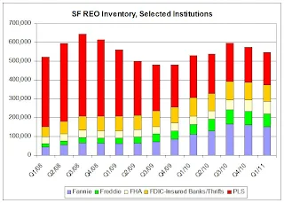 From Tom Lawler: 'The FDIC released its Quarterly Banking Profile for the first quarter of 2011. ... On the REO front [lender Real Estate Owned], the carrying value of 1-4 family residential real estate owned on FDIC-insured institutions’ balance sheet on 3/31/11 was $13.2795 billion, down from $14.0498 billion on 12/31/10 and $14.5527 billion last March. ... Using [$150,000 per REO], here is a chart of REO holdings of Fannie, Freddie, FHA, and FDIC-insured institutions.
Note that this is NOT an estimate of total residential REO, as it excludes non-FHA government REO (VA, USDA, etc.), credit unions, finance companies, non-FDIC-insured banks and thrifts, and a few other lender categories. ... If one “grossed up” the estimates shown in the chart by this factor – which probably produces a “too high” number – then one estimate of the total REO inventory for 1-4 family properties would be around 615,000.
• LPS: Mortgage Delinquency Rates increased slightly in April, Foreclosure pipeline 'Bloated'
According to LPS, 7.97% of mortgages were delinquent in April, up from 7.78% in March, but down from 8.80% in February and down from 9.52% in April 2010. Some of this increase is the normal seasonal pattern.
LPS reports that 4.14% of mortgages were in the foreclosure process, down from the record 4.21% in March. This gives a total of 12.11% delinquent or in foreclosure. It breaks down as:
• 2.24 million loans less than 90 days delinquent.
• 1.96 million loans 90+ days delinquent.
• 2.18 million loans in foreclosure process.
For a total of 6.39 million loans delinquent or in foreclosure in April.
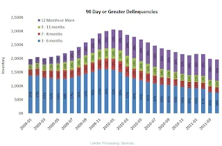 This graph provided by LPS Applied Analytics shows the aging for the 90+ days delinquent bucket.
What is surprising is the large percentage in the 90+ days delinquent bucket that are more than 12 months delinquent and haven't moved to the 'in foreclosure process' bucket. About 40% of loans in the 90+ days bucket - or about 800,000 loans - have been delinquent over a year.
The second graph - from the March report - shows the aging of loans in the foreclosure process.
 '31% of loans in foreclosure have not made a payment in over 2 years.' So about one third of the 2.2 million loans in the foreclosure process haven't made a payment in over 2 years.
These two graphs show the 'bloated' backlog of seriously delinquent loans (90+ days and in foreclosure).
The good news is the improvement in the early stages, however there is still an enormous number of seriously delinquent loans.
• Personal Income and Outlays increased 0.4% in April
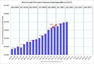 This graph shows real Personal Consumption Expenditures (PCE) through April (2005 dollars).
PCE increased 0.4% in April, but real PCE only increased 0.1% as the price index for PCE increased 0.3 percent in April.
It appears growth in real consumer spending has slowed over the last couple of months.
• Consumer Sentiment increased in May
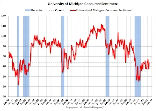 The final May Reuters / University of Michigan consumer sentiment index increased to 74.3 from the preliminary reading of 72.4, and from 69.8 in April.
This was above expectations for a reading of 72.5.
In general consumer sentiment is a coincident indicator and is usually impacted by employment (and the unemployment rate) and gasoline prices.
This is still a low reading, but sentiment probably improved a little possible due to the decline in gasoline prices.
• Other Economic Stories ...
• ATA Trucking index decreased 0.7% in April
• Chicago Fed: Economic activity weakened in April
• Q1 real GDP growth unrevised at 1.8% annualized rate
• Kansas City Manufacturing Survey: Activity was largely unchanged in May
• Richmond Fed shows contraction
Best wishes to all!
 "
"
There might have been a little bit of good news in a surprising sector: housing. New home sales were up a little (still very low), and although mortgage delinquencies increased slightly, the increase was probably seasonal, with both Fannie and Freddie reporting another decline in seriously delinquent loans. Also lender Real Estate Owned (REO) is now declining. Baby steps ...
Also gasoline prices are now down about 16 cents per gallon nationally from the recent peak - and that probably showed up in a small increase in May consumer sentiment.
Below is a summary of economic data last week mostly in graphs:
• New Home Sales in April at 323 Thousand SAAR, Ties Record low for April
 Click on graphs for larger image in graph gallery.
The first graph shows New Home Sales vs. recessions since 1963. The dashed line is the current sales rate.
The Census Bureau reports New Home Sales in April were at a seasonally adjusted annual rate (SAAR) of 323 thousand. This was up from a revised 301 thousand in March (revised from 300 thousand).
 Starting in 1973 the Census Bureau broke inventory down into three categories: Not Started, Under Construction, and Completed. This graph shows the three categories of inventory starting in 1973.
The inventory of completed homes for sale fell to 67,000 units in April. The combined total of completed and under construction is at the lowest level since this series started.
The following graph shows existing home sales (left axis) and new home sales (right axis) through April.
 The gap is due mostly to the flood of distressed sales. This has kept existing home sales elevated, and depressed new home sales since builders can't compete with the low prices of all the foreclosed properties.
I expect this gap to close over the next few years once the number of distressed sales starts to decline.
Although above the consensus forecast of 300 thousand, this ties the record low for April - and new home sales have averaged only 298 thousand SAAR over the last 12 months ... moving sideways at a very low level.
• Three Graphs of REO Inventory
Here are three graphs of lender Real Estate Owned (REO) inventory. The first is for Fannie, Freddie and the FHA. Then we add Private Label Securities, and finally FDIC insured banks and thrifts.
 The combined REO inventory for Fannie, Freddie and the FHA decreased to 287,380 at the end of Q1, from a record 295,307 units at the end of Q4. The REO inventory increased 37% compared to Q1 2010 (year-over-year comparison).
The REO inventory for the 'Fs' increased sharply in 2010, but may have peaked in Q4 2010. The Fs acquired 101,997 REO units in Q1, but sold 110,023. Both are records, and the numbers will probably increase all year.
The second graph includes the data for the Fs and adds Private Label Securities (PLS).
 The PLS blew up first because it contained the worst of the worst loans; poorly underwritten subprime and Alt-A.
Also the PLS wasn't set up to effectively manage REO and they just dumped houses on the market. Usually house prices are sticky downwards - prices decline, but slowly. However this dump of REOs led to what Tom Lawler called 'destickification' with house prices falling rapidly in many low end areas with high foreclosure rates.
Now about half of the REOs are owned by the Fs and they are little more careful in releasing REO to the market.
 From Tom Lawler: 'The FDIC released its Quarterly Banking Profile for the first quarter of 2011. ... On the REO front [lender Real Estate Owned], the carrying value of 1-4 family residential real estate owned on FDIC-insured institutions’ balance sheet on 3/31/11 was $13.2795 billion, down from $14.0498 billion on 12/31/10 and $14.5527 billion last March. ... Using [$150,000 per REO], here is a chart of REO holdings of Fannie, Freddie, FHA, and FDIC-insured institutions.
Note that this is NOT an estimate of total residential REO, as it excludes non-FHA government REO (VA, USDA, etc.), credit unions, finance companies, non-FDIC-insured banks and thrifts, and a few other lender categories. ... If one “grossed up” the estimates shown in the chart by this factor – which probably produces a “too high” number – then one estimate of the total REO inventory for 1-4 family properties would be around 615,000.
• LPS: Mortgage Delinquency Rates increased slightly in April, Foreclosure pipeline 'Bloated'
According to LPS, 7.97% of mortgages were delinquent in April, up from 7.78% in March, but down from 8.80% in February and down from 9.52% in April 2010. Some of this increase is the normal seasonal pattern.
LPS reports that 4.14% of mortgages were in the foreclosure process, down from the record 4.21% in March. This gives a total of 12.11% delinquent or in foreclosure. It breaks down as:
• 2.24 million loans less than 90 days delinquent.
• 1.96 million loans 90+ days delinquent.
• 2.18 million loans in foreclosure process.
For a total of 6.39 million loans delinquent or in foreclosure in April.
 This graph provided by LPS Applied Analytics shows the aging for the 90+ days delinquent bucket.
What is surprising is the large percentage in the 90+ days delinquent bucket that are more than 12 months delinquent and haven't moved to the 'in foreclosure process' bucket. About 40% of loans in the 90+ days bucket - or about 800,000 loans - have been delinquent over a year.
The second graph - from the March report - shows the aging of loans in the foreclosure process.
 '31% of loans in foreclosure have not made a payment in over 2 years.' So about one third of the 2.2 million loans in the foreclosure process haven't made a payment in over 2 years.
These two graphs show the 'bloated' backlog of seriously delinquent loans (90+ days and in foreclosure).
The good news is the improvement in the early stages, however there is still an enormous number of seriously delinquent loans.
• Personal Income and Outlays increased 0.4% in April
 This graph shows real Personal Consumption Expenditures (PCE) through April (2005 dollars).
PCE increased 0.4% in April, but real PCE only increased 0.1% as the price index for PCE increased 0.3 percent in April.
It appears growth in real consumer spending has slowed over the last couple of months.
• Consumer Sentiment increased in May
 The final May Reuters / University of Michigan consumer sentiment index increased to 74.3 from the preliminary reading of 72.4, and from 69.8 in April.
 This was above expectations for a reading of 72.5.
In general consumer sentiment is a coincident indicator and is usually impacted by employment (and the unemployment rate) and gasoline prices.
This is still a low reading, but sentiment probably improved a little possible due to the decline in gasoline prices.
• Other Economic Stories ...
• ATA Trucking index decreased 0.7% in April
• Chicago Fed: Economic activity weakened in April
• Q1 real GDP growth unrevised at 1.8% annualized rate
• Kansas City Manufacturing Survey: Activity was largely unchanged in May
• Richmond Fed shows contraction
Best wishes to all!
Comments