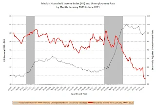
Misc: Market and more on Household Income:  This graph (click on graph for larger image) from Doug Short shows the recent volatility.
And some followup on the story this morning in the NY Times on the median income falling: Recession Officially Over, U.S. Incomes Kept Falling
From David Leonhardt at the NY Times: Behind a Surprising Income Trend.
And Felix Salmon provides a graph of falling income in the U.S.: Chart of the day, median income edition

Here is the report from Sentier Research.

And some followup on the story this morning in the NY Times on the median income falling: Recession Officially Over, U.S. Incomes Kept Falling
From David Leonhardt at the NY Times: Behind a Surprising Income Trend.
And Felix Salmon provides a graph of falling income in the U.S.: Chart of the day, median income edition
Every month, the Current Population Survey goes out to a nationally representative sample of more than 50,000 interviewed households and their members. And in one of the questions, those households — or at least the households who didn’t answer the same question the previous month — are asked how much money they made, in total, over the past 12 months. That question has now been asked in 138 successive months, since January 2000. Which means that with a bit of clever analysis, it’s possible to put together an apples-to-apples comparison of what has happened to household income every month.
And when you do that, the results are very scary indeed.

The red line, here, is median real household income, as gleaned from the CPS, indexed to January 2000=100. It’s now at 89.4, which means that real incomes are more than 10% lower today than they were over a decade ago.The gray line is the unemployment rate. Pretty scary indeed!
Here is the report from Sentier Research.
Comments